The Orkney Power Curve
- Exploring methods for modeling the relationship between wind speed and Orkney energy production
Introduction
As we would expect, there’s a fundamental (and causal) relationship between how much the wind is blowing and how much energy a wind turbine produces. This relationship is often modeled as a power curve: A single variable function describing the power output at a given wind speed. In this post we will look at a couple of methods for inferring a power curve for the entire renewable energy production in Orkney. We will use energy data scraped from SSEN, the Orkney DSO and weather forecasts collected from the UK MetOffice, both of which has been collected continuously over the past year.
The code and data for this post is available as a .zip containing a Jupyter notebook and a couple of CSVs.
Power Curves
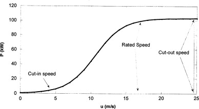
The power curve of a wind turbine typically has a sigmoid-ish shape (see Figure 1), denoting the cut-in speed, the rated speed and the cut-out speed. This curve is useful for a host of applications, such as forecasting, anomaly detection and condition monitoring.
Theoretical power curves are often produced by the turbine manufacturer, but the actual results of a turbine can deviate considerably depending of the environment in which the turbine is placed. Since we are planning to find a combined power curve for an entire fleet of heterogenous wind turbines, we cannot use the individual theoretical power curves, as we do not know precisely which classes of turbines are in the fleet.
Instead, we infer the power curve using the measured total renewable energy production of Orkney and weather model estimations of wind speeds.
The Data
In order to construct a power curve, we need information about power generation and wind speed. The dataset we use stretches from the 1st of May 2019 to the 1st of June 2020.
Power generation
Data about the current generation of renewable energy in Orkney has been collected every minute from the website of SSEN, the Orkney DSO.
More than 90% of the renewable energy production in Orkney is wind-based, so it should be possible to use this as proxy for the current wind power generation. This data is also subject to other factors, such as wind turbine curtailment1 and grid instabilities. We therefore expect a significant amount of noise and outliers in the data.
Wind speed
We do not have concrete wind measurements from Orkney. Instead we use the weather forecasts made available by the UK MetOffice. We choose the forecasts for Westray Airfield, as it is located in the north western part of Orkney, where the majority of turbines are. Also the airfield has a weather station, which presumably increases the quality of the forecasts.
The forecasts are made for 3-hour intervals, with lead times from 1-117 hours2. The closest thing we have to wind speed measurements is the forecast with the shortest lead time, so we filter our queries by lead == 1.
Using (short-term) model forecasts for a single location as the proxy for wind conditions on an entire archipelago obviously also introduces noise and inaccuracies in the data, which should be kept in mind during the data analysis.
The Dataset
To align the times of our two data sources, we take 3-hour-averages of the power generation data, and join the two data-sources on time/target-time. The resulting dataset contains 2173 rows, can be downloaded as a csv here. We can now make a scatter plot of the date to visualize the relationship we have been talking about.
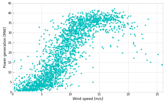
From Figure 2 we can clearly see a relationship: Low wind speed means low power generation, and vice versa. And if we squint a bit we can also see the sigmoid-ish shape from Figure 1, although there’s a lot variability in the data, especially for wind speeds in the range of 7-12 m/s. Still, it should be possible to derive a reasonable power curve from this. So let’s continue with some modeling.
Modeling
We’ll look at four techniques for inferring a power curve:
- Linear and Polynomial Regression
- Grouping and Averaging
- Weighted polynomial regression at fitting points
- Feed-Forward Neural Networks
We’ll evaluate the models using the Root Mean Squared Error (RMSE) metric on non-shuffled 5-fold cross-validation. When plotting the power curves, we will use a model trained on the entire dataset, but the RMSE shown in the legend is the one obtained from cross-validation.
Linear and Polynomial Regression
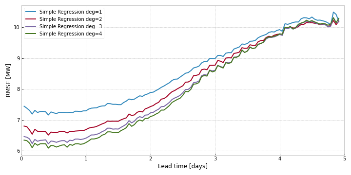
First of, lets try just fitting some linear regressions to the data. In Figure 3, we fit linear regressions of different degrees to the data. Degree 0 is the same as simply taking the mean of the data. Degree 1 is a regular linear regression. From 2 and upwards it is polynomial linear regression, fitting a polynomial function to the data. The two bends in sigmoid-ish curve we saw when squinting at the data looks like something that could be modeled by a 3rd degree polynomial.
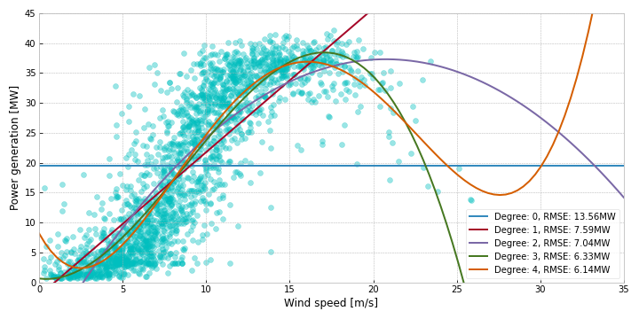
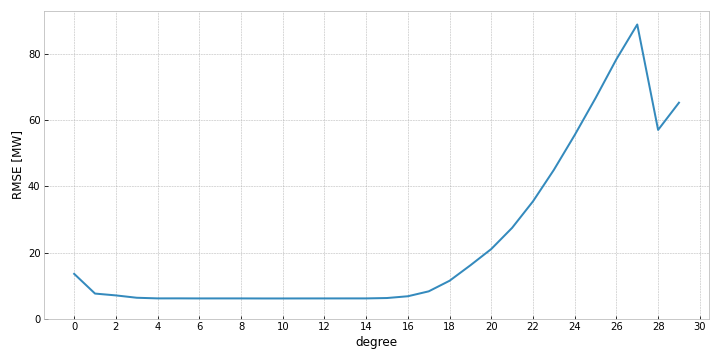
As we can see from Figure 3, the largest improvements in performance is up until the third degree. The fourth degree adds a bit of accuracy as well, and we might be tempted to keep adding degrees in hope of further gains. But after the fourth degree, we would not be improving performance, but just be adding complexity. Once you hit a high enough complexity, performance deteriorates quite rapidly, possibly due to rounding errors in the higher degree terms. Figure 4 shows the performance all the way up until the 30th degree.
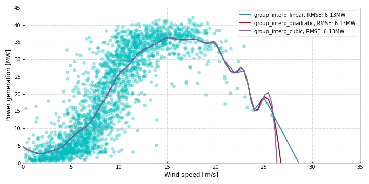
Grouping and Averaging
Another approach, that is mathematically simpler, consists of rounding, grouping and averaging. We round all the wind speeds to their nearest integer value, partition data into groups based on rounded wind speed, take the mean of the power generation data in each group, and interpolate between these points. We experiment with different types of interpolation (linear, quadratic and cubic), but find no noticeable difference in performance.
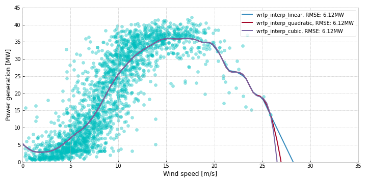
Weighted polynomial regression at fitting points
The simpler regression methods seem unable to fully represent the non-linear powercurve, and the grouping strategy loses data precision when we round all the wind speeds to the nearest integer value. A way to combine the two methods is to do weighted regression at several fitting points. The steps are the following:
- Select a number of fitting points evenly distributed over the range of the x-values.
- For each fitting point:
- Give each data point a weight relative to its proximity to the fitting point.
- Fit a polynomial linear regression using the dataset and the weights.
- Save the output of the newly trained regression model using the fitting point as input
- Interpolate between the saved points
For these experiments, we have used 30 fitting points, And for the weights, we use a normal distribution with a mean equal to the current fitting point and a standard deviation equal to the distance between fitting points.
Feed-Forward Neural Networks
Neural networks are extremely popular, especially due to their ability to learn complex non-linear relationships well. For these experiments we use a fairly standard Feed-Forward Neural Network (FFNN), also called a Multi-Level Perceptron (MLP), trained with the rmseprop optimizer and the relu activation function, running 50 epochs with a batch size of 32. The loss function used is Mean Squared Error.
We experiment with the number of layers and nodes per layer to find a suitable complexity for the task. Six of these experiments are shown in Figure 7. The best performing model is the one with 5 layers and 64 nodes per layer, performing slightly worse than the other techniques.
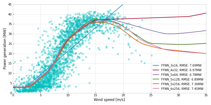
FFNN_5x64 indicates a network with 5 layers and 64 nodes per layer.Comparing techniques
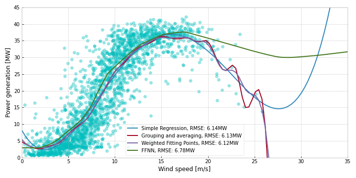
If you’ve been keeping score of the RMSEs listed on the figures throughout this section, you’ve probably noticed that we have not gotten a lot of performance increases from applying increasingly complex techniques to the problem. In Figure 8, we compare the best performing model from each technique, and we can see that the results are roughly similar, with the FFNN performing worse on the upper wind speeds.
By looking at the curves and including our domain knowledge about how turbines work (cut-in/out speeds), we can see that the 4th degree polynomial has some weird behavior in the edge cases. We do not expect the power output to always be 8MW when the wind speed is 0 m/s. In fact, we probably expect it to be near zero. The higher measurements here are probably due to noise/inaccuracies in the data. But these errors are magnified by the polynomial. Similarly, if we suddenly forecast wind speeds of 35+ m/s, the polynomial would output an extremely high power output, although this is beyond the cut-out speeds of all the turbines.
The weighted fitting-points method seem like the best compromise: A fairly smooth curve that stays relatively low at low wind speeds, and cuts off completely at extremely high wind speeds.
Conclusion
So, what can we take away from all these curves? It seems that for simple noisy data like this, increasing the complexity of the model does not do much in the way of performance. If we had more accurate data, or more features, then the complexity might be warranted. But for these cases, the computationally light regressions are good enough.
If we want to improve our power curves, the next steps should be improving data quality or adding more relevant features (like wind-direction, air pressure, ect).
Bonus: What about forecasting?
Since we are using weather forecasts as our model input, it seems obvious to evaluate the models on the forecasts with longer lead-times as well. The MetOffice provides 5-day forecasts, with the longest lead-time being 117 hours. Evaluating our models on all the different lead-times gives us an idea about how the uncertainty increases. Note here, that the modes are trained on all the data, so the accuracies are not completely comparable with the cross-validated results.
As we can see in Figure 9, the errors stay quite low for the first day, but increases with the lead time, ending up at an RMSE over 10MW. Interestingly the FFNN errors are slightly higher throughout, possibly due to overfitting.
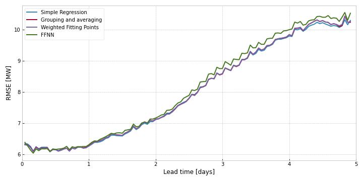
Interestingly, when comparing underfit models, like the lower degree simple regressions, the difference in errors decrease as lead-time increases.
- In this context, curtailment is the act of purposefully slowing or halting turbines in order to ensure the stability of the electrical grid. To learn more about the Orkney curtailment scheme, check out the Msc Thesis i wrote on the subject [return]
- Within the field for forecasting, the “source” time denotes when the forecast was made, the “target” time denotes what time the forecast is for, and the “lead time” is the difference between the two. The lead time is also called the “forecast horizon” or “hours ahead”. [return]